Responsive Card Gallery
I built this responsive card gallery to demonstrate dynamic content filtering, multi image carousels, and a clean, modern user interface, showcasing robust frontend development.

Overview
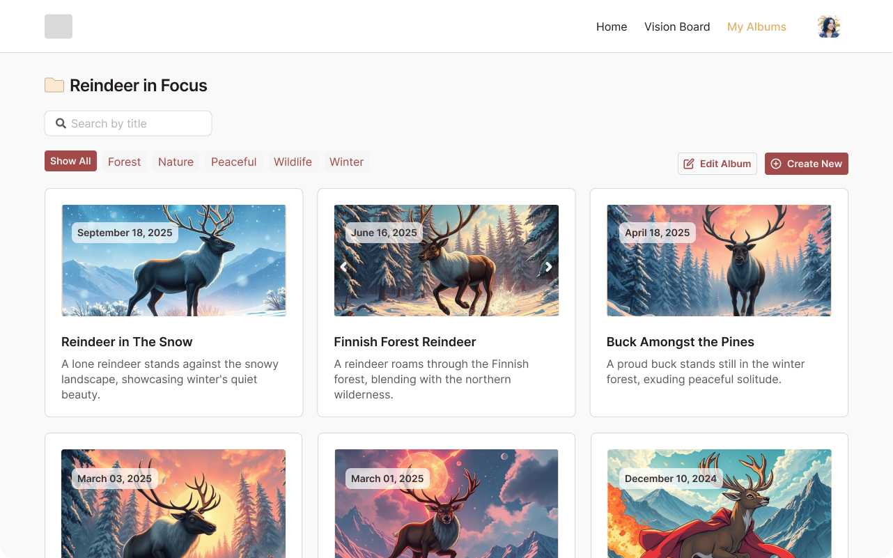
This project is a fully responsive card gallery designed to efficiently display and filter content. It allows users to search for cards by various criteria, including title, description, and category, providing a highly interactive and user-friendly experience for navigating through a collection of items.
A key feature of the gallery is its integrated carousel functionality for individual cards that have multiple associated images. This provides a rich visual experience, allowing users to browse different perspectives or details of each item without leaving the main gallery view. The entire design prioritizes a modern aesthetic and ensures seamless usability across all device sizes.
Problem
The primary challenge was implementing a highly efficient and accurate search and filtering mechanism that could process user input across multiple content fields (title, description, category) in real-time. This required careful JavaScript logic to ensure responsiveness without sacrificing user experience.
Another hurdle was integrating the carousel functionality seamlessly within each card component. Ensuring that the carousels were responsive, accessible, and performed smoothly, especially when many cards were displayed, was a critical design and development consideration.
Approach
My process for this project started with structuring the HTML markup to create a semantic and accessible foundation for the cards and gallery layout. I focused on a mobile-first approach, ensuring the basic layout was solid before adding complexities.
For styling, SCSS was leveraged to build a scalable and maintainable stylesheet. I designed the card components to be modular and reusable, with styles that adapt fluidly to different screen sizes. The core functionality, including the search filter and the carousel logic, was implemented using vanilla JavaScript. I focused on writing clean, efficient, and well-commented code to handle DOM manipulation, event listeners, and dynamic content updates, ensuring smooth user interactions. Regular testing was performed across various breakpoints to guarantee responsiveness.
Technical Decisions
I chose a lean stack for this project, leveraging HTML5 for semantic structure, SCSS for advanced and organized styling, and vanilla JavaScript for all interactive functionalities. This allowed for maximum control over performance and a deep dive into core front-end programming concepts without relying on heavier frameworks.
The decision to use vanilla JavaScript for the search and carousel logic demonstrated a strong understanding of fundamental DOM manipulation and event handling. SCSS was crucial for implementing responsive design patterns efficiently, ensuring the gallery looked and functioned flawlessly from mobile to desktop. This lean approach highlights the ability to deliver robust features with focused technical choices.
Impact
Developing this responsive card gallery reinforced the importance of efficient JavaScript for dynamic client side interactions. It showcased how carefully crafted vanilla JavaScript can deliver powerful features like real-time search and carousels, providing a highly interactive experience.
This project also highlighted the critical role of semantic HTML and well structured SCSS in building scalable and maintainable frontend applications. It strengthened my understanding of responsive design best practices, proving the ability to create visually appealing and functional interfaces that adapt effortlessly to any screen size.
Visual Identity
Interface System