Modern Vue Dashboard
A modern dashboard interface exploring how complex information can be presented through a clean, responsive, and highly interactive experience. The concept combines real estate data, financial tools, property discovery, and AI assistance into a cohesive interface.
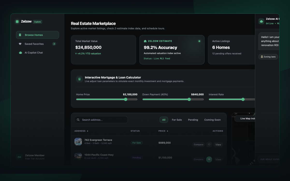
Modernizing the digital experience.
This project started as an exploration of modern dashboard design and how multiple tools and data points can work together without making the interface feel overwhelming.
The experience brings together property listings, interactive maps, mortgage calculations, property comparisons, and an AI assistant. Each feature was designed to feel like part of the same system rather than a collection of disconnected components.
Balancing information with simplicity
The challenge was creating a dashboard that could support a large amount of information while remaining easy to navigate.
I focused on establishing clear visual hierarchy and reusable interface patterns. Search, filtering, sorting, property details, financial tools, and comparison features needed to work together without competing for attention.
The interface also needed to feel modern and responsive across different screen sizes.
Execution Steps
I began by defining the overall layout and visual direction before building the individual interface components.
The design uses a restrained color palette, subtle borders, rounded surfaces, and glassmorphic elements to create depth without relying heavily on visual effects. Interactive states were also considered throughout the experience so that controls, overlays, modals, and drawers feel consistent.
For development, I used Vue.js with Tailwind CSS to build the interface as a collection of reusable components. This allowed the dashboard to remain flexible while supporting the many interactive elements within the experience.
Technical Decisions
Vue.js provided a lightweight structure for managing the interactive portions of the dashboard. I used Vue's reactive state and computed properties to handle filtering, sorting, theme changes, calculations, and other UI state.
Tailwind CSS was used to establish the visual system directly within the component layer. This made it possible to iterate quickly on spacing, responsive behavior, states, and visual treatments without introducing a large custom stylesheet.
The project also incorporates Leaflet for the interactive map and demonstrates how third-party functionality can be integrated into a cohesive frontend experience.
Color Palette
Delivering measurable value and long-term success.
This project gave me an opportunity to explore how modern interface patterns can make complex information feel more approachable. The biggest takeaway was the importance of treating the dashboard as a connected system rather than a collection of individual screens. Navigation, data presentation, interactive states, overlays, and supporting tools all need to feel like they belong to the same product.
This project allowed me to explore:
- Dashboard Design Creating a flexible interface for presenting dense information without sacrificing clarity.
- Interactive UI Designing connected interactions across filtering, sorting, comparison, calculations, maps, modals, and drawers.
- Visual Systems Using consistent spacing, surfaces, borders, typography, and glassmorphic treatments to establish a cohesive interface.
- Frontend Development Building a responsive and interactive experience with Vue.js and Tailwind CSS.
Continue Exploring
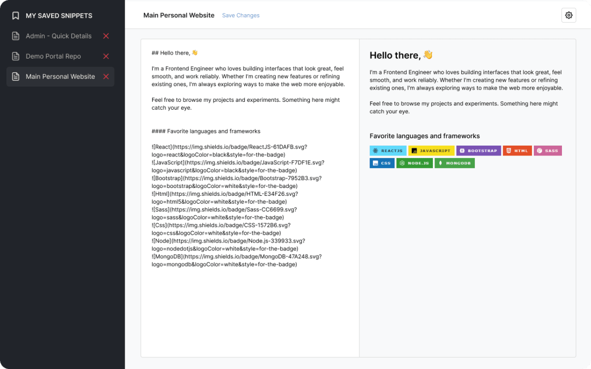
Modular Markdown Editor
The Modular Markdown Editor is a single-page, fully modular markdown editor built with vanilla JavaS